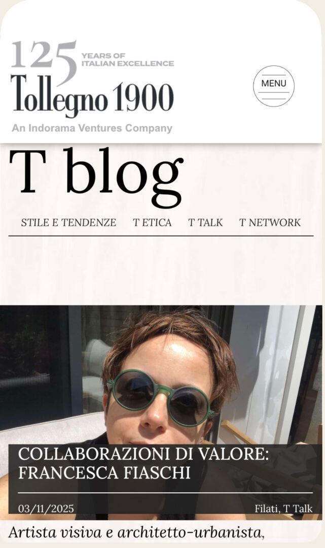
Valuable Collaborations: Francesca Fiaschi /03.11.2026/Filati-T Talk
Visual artist and architect-urban planner, Francesca Fiaschi (fifi) used Tollegno 1900’s Harmony and Feeling yarns for her work Zones d’ambiguïté – Couleur et perception altérée à travers papier et textile, presented at the 15th Florence Biennale.

Two of Tollegno 1900’s iconic yarns – Harmony and Feeling – also took part in the 15th Florence Biennale (October 18–26) through the artwork created by Francesca Fiaschi, a visual artist and architect-urban planner with a strong academic and professional background.
Francesca, what are the main steps in your educational and creative journey that led you to create a work for the Florence Biennale?
My path combines architectural and artistic training in Italy with work and research experiences in Africa, Asia, and North America. The influence of these contexts is reflected in my work, where local colors and natural and urban landscapes are transformed into woven patterns and abstract forms. I let color guide me: whether it’s multiple or reduced to binary contrasts, it’s always the core of my practice. From there come forms, textures, and the choice of materials — paper, wood, plaster, canvas, and yarns — as well as pigments ranging from oil to watercolor, ink to digital hues, and even natural colors extracted from spices like coffee, turmeric, paprika, and saffron.
So, travel is an essential part of your journey…
Exactly. In 2014 I moved to Montreal, where I began working as an illustrator, later approaching printmaking and screen-printing techniques. These experiences opened the way to a broader practice that combines visual arts, craftsmanship, and design. My background in architecture and my PhD in urban planning in Canada taught me to approach complexity methodically and translate it into concrete solutions. This approach also informs my artistic work: chromatic analysis guides material choices and dialogue with artisans, but within this rational framework, intuition finds its space — giving strength and uniqueness to each piece.
Another step in your evolution is represented by your focus on CVD – Color Vision Deficiency.
Yes, especially in recent years I have focused on Color Vision Deficiency (CVD), creating artworks that can be perceived even under altered visual conditions. Today, my research on chromatic composition involves textile craftsmanship — working with materials such as cashmere, silk, wool, cotton, and acrylic — pushing color beyond the surface toward an experience that is both visual and tactile.
This “journey” of growth also includes your participation in the Biennale held in Florence at the end of October. What is the title of the project you developed?
The project is titled Zones d’ambiguïté – Couleur et perception altérée à travers papier et textile (2025), translated into Italian as Zone di Ambiguità. It is a fiber art work that originates from chromatic studies on Japanese paper and takes form in textile through needle tufting on 100% cotton canvas, using extrafine merino wool, cashmere, and silk — Italian yarns by Tollegno 1900.
What inspired its creation?
Zones d’ambiguïté stems from the idea of exploring how the same color, when applied to different materials, can transform perception and alter the way we read forms. The composition establishes a dialogue between Japanese paper and textile: through variations in density, weave, and relief in extrafine merino, cashmere, and silk, color becomes matter, revealing distinct visual and tactile sensations. The use of absolute black, which erases textures, introduces zones where perception becomes uncertain or disappears altogether.
The work also integrates protanopic vision (red-green color deficiency) from the start. The optical cones are shifted to reproduce the hues perceived by those experiencing this condition, offering an alternative reading of the forms and generating the ambiguity that gives the work its title. A QR code accompanies the piece, opening access to a virtual space where the entire surface can be explored in its protanopic version — an immersive experience that juxtaposes real and altered perception.
How would you explain your work to a Biennale visitor?
It’s a textile piece that works on color perception. At first glance, it seems like a dialogue between geometric forms and fine materials, but it actually reveals that what we perceive in one way may be “read” differently by others. Some areas of the work integrate color-blind vision, showing how the same color can take on different meanings depending on one’s visual perception. The QR code allows visitors to access a virtual space where the entire composition can be seen through protanopic eyes. The goal is not to homogenize perceptions, but to raise awareness of differences and learn to include them.
Among the yarns used, you chose two of Tollegno 1900’s signature products. How did you get in touch with the brand?
Through targeted research on high-quality Italian yarns. As a researcher, it was easy for me to recognize that Tollegno 1900 embodies excellence: a supply chain that blends innovation and tradition, perfect for transforming color into material.
Which Tollegno 1900 yarn did you choose for this piece, and why?
I mainly chose Harmony, made of 100% extrafine merino wool. Its uniformity and compactness allowed me to precisely control density, weave, and pile height during the tufting process, ensuring both stability and chromatic consistency. I was also guided by the wide range of available shades in Tollegno 1900’s color chart, which allowed me to achieve the desired variations without additional processing.
However, you also used a second yarn…
Yes, I also integrated Feeling, a blend of 70% extrafine merino, 20% silk, and 10% cashmere. Each fiber plays a distinct role: merino wool provides structural compactness and regularity, silk adds luminosity and color intensity, and cashmere offers softness and tactile refinement. The combination of these three materials produces a balanced yarn that enhances both sensory depth and chromatic brilliance.
Using the two yarns together allowed me to achieve a balance between technical control, color depth, and sensory quality, turning color into living matter — as was my initial intent. This result was also made possible thanks to Tollegno 1900’s know-how and yarn quality.
Which features of the yarn proved most functional for your artistic project?
The decisive factors were compactness, uniformity, and chromatic consistency of the extrafine merino in Harmony, which enabled me to work with millimetric precision on density, weave, and pile height — essential to translate chromatic variations into material nuances without losing legibility in the design.
As for Feeling, the combination with silk and cashmere added softness and sheen, allowing the textile to convey not only color but also a richer sensory quality. The way light reacts on these fibers enhanced both contrasts and tonal gradations. Together, these qualities enabled a balance between technical rigor and perception, turning the yarn itself into a true expressive tool.
Are you already working on other projects — can you share any details?
Yes, I am already developing new projects. I’m currently conducting chromatic analyses on different supports, using yarn as my primary medium. Each yarn has its own texture and creates new ones in the weaving process. I’m interested in observing how color transforms in relation to these material variations and how this influences perception. I’m also studying new chromatic palettes designed to respond to altered vision conditions.
We’ll soon see where this research leads, but Tollegno 1900 will certainly remain part of my future projects — I’m deeply grateful for the quality of their yarns and their contribution to this work.